> For the complete documentation index, see [llms.txt](https://docs.secoda.co/llms.txt). Markdown versions of documentation pages are available by appending `.md` to page URLs; this page is available as [Markdown](https://docs.secoda.co/features/dashboards.md).
# Dashboards
{% hint style="info" %}
Dashboards are currently in early access. [Join the waitlist](https://tally.so/r/wabaZv)
{% endhint %}
### Overview
Dashboards let you build custom visualizations by writing SQL queries and displaying them as interactive charts. Use them to monitor key metrics, track trends, and share insights with your team.
Dashboards help you stay on top of your data by bringing SQL-powered metrics into a single, customizable view.
You can use dashboards to:
* Track key metrics across your data sources
* Visualize data with charts, tables, and single-value displays
* Organize related metrics in one place for easy monitoring
* Share data insights with specific teams and collections
* Reuse metrics across multiple dashboards
### Creating dashboards with Secoda AI
Secoda AI can build metrics and dashboards for you through natural language conversation. Simply describe what you want to visualize, and the AI will handle the SQL, chart selection, and configuration.
#### What AI can do
Secoda AI can:
* Create individual metrics from simple requests like "Show me monthly revenue"
* Build multiple related metrics for comparisons like "Compare sales by region and product"
* Generate comprehensive dashboards with many metrics from requests like "Create a sales performance dashboard"
* Modify existing metrics by changing SQL queries, chart types, or formatting
* Write and optimize SQL queries against your data sources
* Choose appropriate chart types based on your data
* Configure chart settings including formatting, axes, and visual options
#### How to use AI
Open Secoda AI and describe what you want in plain language. The AI understands various request types:
**Single metrics**: "What's our customer churn rate this quarter?" or "Show me top 10 products by revenue"
**Multiple metrics**: "Compare our marketing spend across channels" or "Display key performance indicators for Q4"
**Full dashboards**: "Build a customer analytics dashboard" or "Create an overview of our sales performance"
**Modifications**: "Change this to a bar chart" or "Update the SQL to filter by region"
The AI will analyze your request, explore your data sources, write the necessary SQL, and create the visualizations. You can refine the results through conversation by asking for changes or additions.
#### Getting the best results
Be specific about what you want to see. Instead of "show me sales," try "show me monthly sales by region for the last year." The AI works best when it understands:
* What metrics or data you want to visualize
* How you want to segment or group the data
* The time period you're interested in
* Whether you want a single metric, a few related metrics, or a comprehensive dashboard
After the AI creates your metrics or dashboard, you can continue the conversation to make adjustments, add more metrics, or change visualizations.
### Creating a dashboard manually
To create a new dashboard:
1. Go to **Dashboards** under the team dropdown
2. Click the **Create dashboard** button
3. Enter a title and description
4. Add metrics to the dashboard
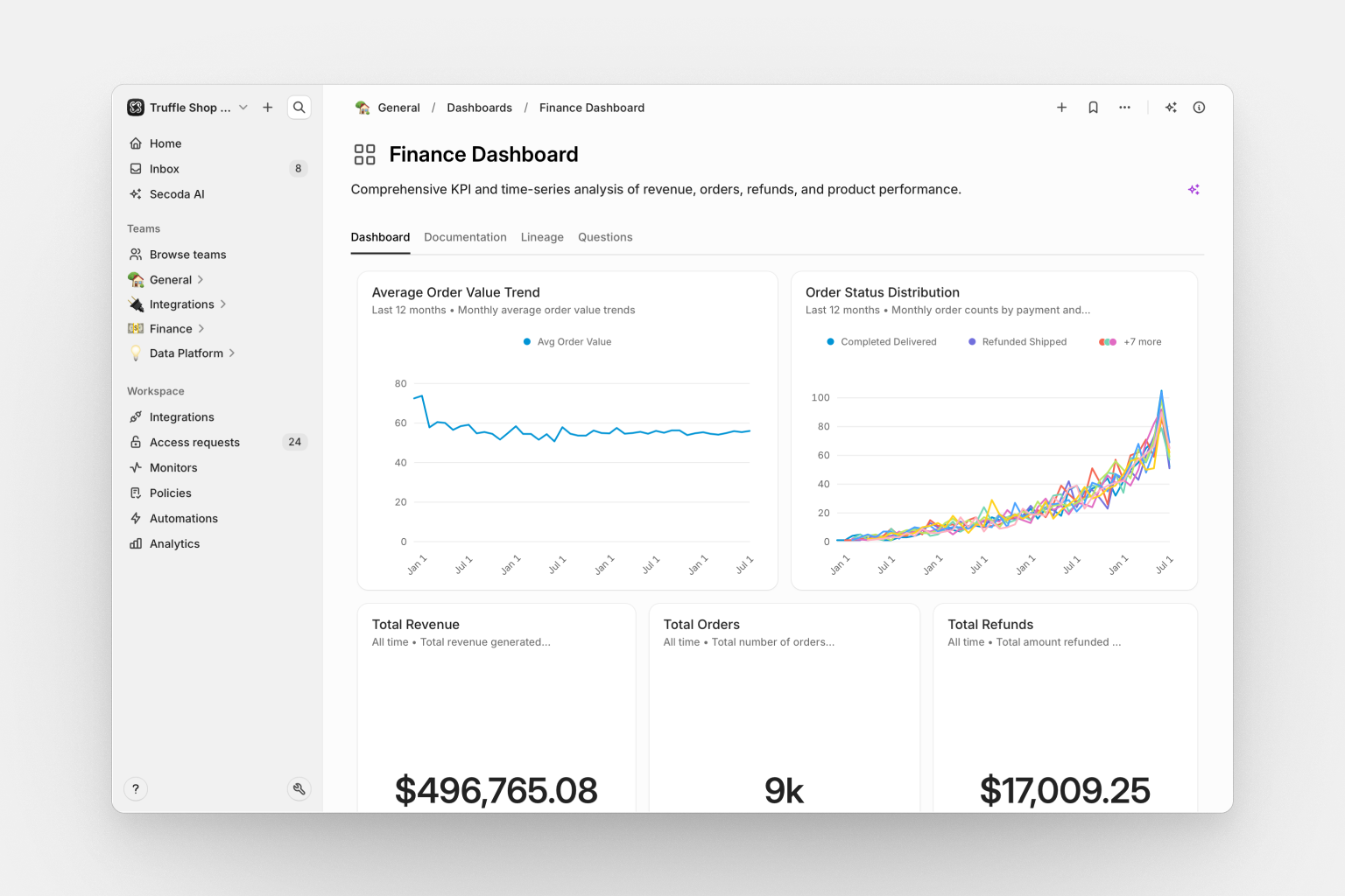
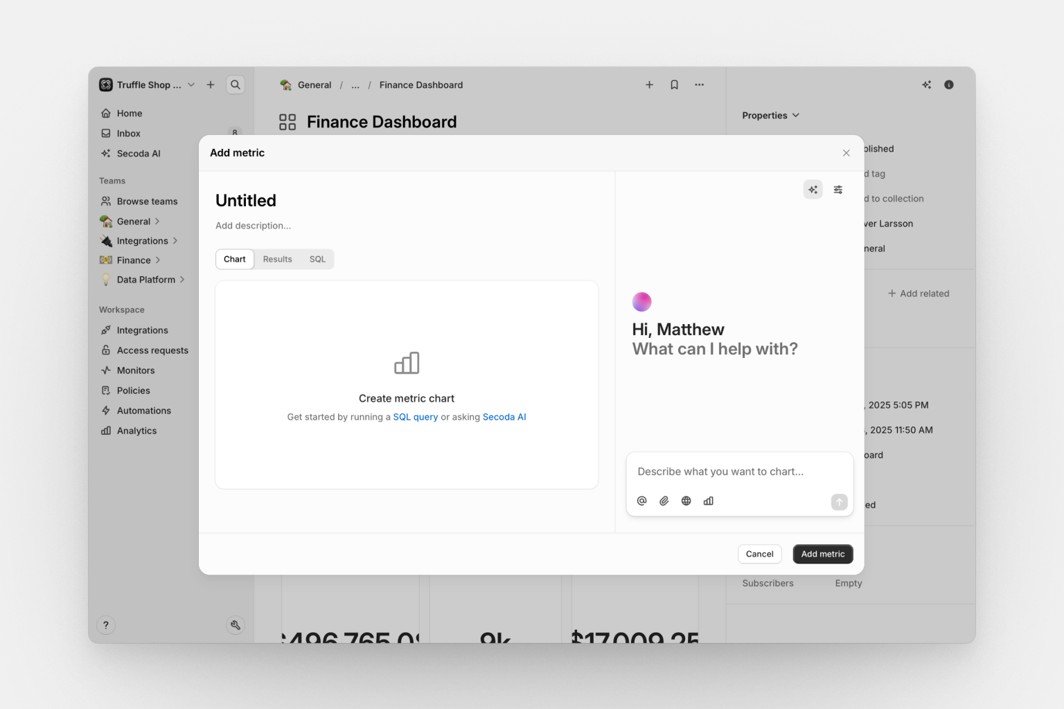
### Adding metrics
Metrics are SQL-powered visualizations that display on your dashboard. After creating a dashboard, click **Add Metric** to either create a new metric or add existing ones. Each metric you add appears as a widget that you can arrange and resize.
To create a metric, write a SQL query against your connected data sources, choose a visualization type, and configure the chart settings. Your metric will immediately appear on the dashboard and can be reused on other dashboards.
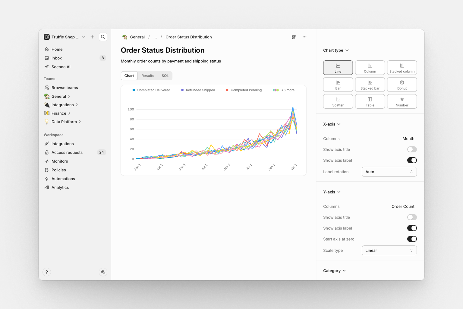
### Chart types
Secoda supports six chart types to visualize your data:
#### Bar chart
Display data as vertical or horizontal bars to compare values across categories. Choose between side-by-side, stacked, or percentage-stacked arrangements, and sort in ascending or descending order.
#### Line chart
Show trends over time or continuous data. Lines can be straight, smooth curves, or step functions, displayed as lines or filled areas. Supports stacking and optional data point dots.
#### Scatter chart
Plot relationships between variables with X and Y axes. Add category grouping for color-coding and a size dimension to create bubble charts.
#### Pie chart
Display proportions and percentages in a circular format. Adjust the donut width to create donut charts, and show labels as percentages or absolute numbers.
#### Table
Show raw data in a structured table. Customize column order, apply formatting (currency, dates, numbers), and control sorting.
#### Number
Display a single key metric prominently. Choose from aggregation functions (sum, average, median, max, min, count, first) and add custom headers. Format as currency, percentages, or compact notation (1K, 1M).
### Formatting charts
All charts support formatting options to help you present data clearly:
**Numbers**: Format as currency (USD, EUR, etc.), percentages, or compact notation (1K, 1M). Replace missing values with a default number.
**Dates**: Use custom formats, display as relative dates ("2 days ago"), control timezone handling, and set time intervals (day, week, month, quarter, year) for grouping.
**Axes**: Add custom titles, show or hide labels and ticks, rotate labels for readability, choose logarithmic or linear scales, and control whether the Y-axis starts at zero.
**Visual options**: Toggle legend and grid line visibility to balance clarity and information density.
### Using dashboards
#### Layout
Dashboards use a drag-and-drop layout system. Drag metrics to reposition them and resize by dragging their edges. Layout changes save automatically.
#### Tabs
Each dashboard includes multiple tabs:
* **Dashboard** — Interactive view with all your metrics
* **Documentation** — Rich-text documentation to explain the dashboard
* **Lineage** — Data lineage showing sources and dependencies
* **Questions** — Collaborative space for team discussions
#### Sharing
Control dashboard access by assigning it to teams. Add dashboards to collections to organize by topic, department, or use case.
Permissions are role-based:
* **Viewers** can see and interact with dashboards
* **Editors** can create and modify dashboards
* **Admins** have full management capabilities
### Managing dashboards
#### Editing metrics
Click a metric's header to modify its SQL query or chart configuration. Changes save automatically.
Metrics can be reused across multiple dashboards. Use the dashboard icon on a metric to manage which dashboards display it. Removing a metric from a dashboard only affects that specific dashboard.
#### Finding dashboards
All dashboards are searchable by title, description, or content. Filter by tags, collections, or owners. Popularity metrics show which dashboards your team uses most.
#### Data lineage
Dashboards automatically track data lineage. View upstream data sources to see which tables feed into your metrics, and check downstream dependencies to understand what else might be affected by changes.
#### Documentation
Add rich-text documentation to explain your dashboard. Include images, links, and detailed explanations. Version history lets you see how documentation has evolved over time.
#### Questions
Team members can ask questions, share insights, and discuss interpretations directly on the dashboard. Participants receive notifications when new responses arrive.
#### Monitors
Set up data quality monitors to track freshness, volume changes, and anomalies in your underlying data. Monitors help you catch issues before they affect stakeholders.
#### Permissions
Dashboard access follows a layered system. Dashboards inherit permissions from assigned teams and collections. Role-based access determines capabilities: viewers see dashboards, editors create and modify them, and admins have full control.
You'll need an Editor role or higher to create or modify dashboards. Managing team dashboards requires membership in those teams.
### Troubleshooting
#### Metric not loading
If a metric shows an error or won't load, check:
* **SQL syntax**: Verify your query syntax, including commas and quotation marks
* **Tables and columns**: Ensure all referenced tables and columns exist
* **Schema changes**: Check if columns were renamed or removed
* **Data source connection**: Verify the integration is active in settings
* **Database permissions**: Confirm you have read access to the queried tables
Try running your SQL query directly in a SQL editor to isolate whether the issue is with the query or Secoda's connection.
#### Dashboard not appearing in search
If a dashboard doesn't show up in search:
* **Team assignment**: Assign the dashboard to at least one team (unassigned dashboards are treated as drafts)
* **Permissions**: Verify you're a member of the assigned teams
* **Search indexing**: Wait a minute for the search index to update after creating or modifying a dashboard
If the problem persists, contact your Secoda administrator.
### FAQ
How many metrics should I add to a dashboard?
While there's no technical limit, most effective dashboards have 5-10 metrics that tell a cohesive story. Consider splitting large dashboards into multiple themed dashboards.
Can I export data?
Yes. Each metric includes an export option to download data as CSV or other formats.
How do I share with external users?
External sharing requires guest accounts with limited permissions. Talk to your Secoda administrator about setting up guest access.
Can I embed dashboards?
Embedding for Dashboards is currently unavailable.
---
# Agent Instructions
This documentation is published with GitBook. GitBook is the documentation platform designed so that both humans and AI agents can read, navigate, and reason over technical content effectively. Learn more at gitbook.com.
## Querying This Documentation
If you need additional information that is not directly available in this page, you can query the documentation dynamically by asking a question.
Perform an HTTP GET request on the current page URL with the `ask` query parameter, and the optional `goal` query parameter:
```
GET https://docs.secoda.co/features/dashboards.md?ask=&goal=
```
`ask` is the immediate question: it should be specific, self-contained, and written in natural language.
`goal` is optional and describes the broader end goal you are ultimately trying to accomplish on behalf of the user. GitBook uses it to tailor the answer towards what is most useful for that goal.
The response will contain a direct answer to the question and relevant excerpts and sources from the documentation.
Use this mechanism when the answer is not explicitly present in the current page, you need clarification or additional context, or you want to retrieve related documentation sections.