> For the complete documentation index, see [llms.txt](https://docs.secoda.co/llms.txt). Markdown versions of documentation pages are available by appending `.md` to page URLs; this page is available as [Markdown](https://docs.secoda.co/features/analytics-dashboard.md).
# Analytics
Admins and Editors have access to the Analytics dashboard and overview pages which showcases how their Secoda workspace is being used. They also receive a weekly email that highlights the metrics in this analytics dashboard.
### AI Analytics
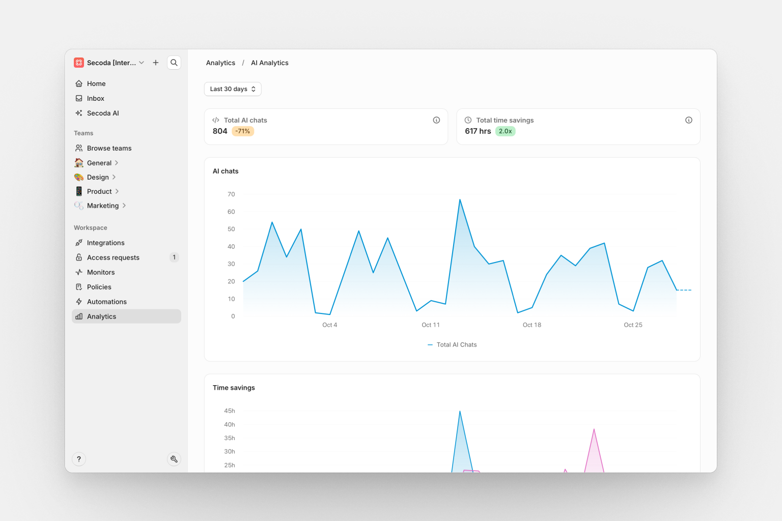
AI Analytics helps you track Secoda AI adoption and measure productivity impact across your workspace.
**Key metrics:**
* **Total queries**: Number of AI conversations in the selected time period, with percentage change from previous period
* **Total time savings**: Estimated manual effort saved, calculated based on query complexity, data sources, and task type
**Time series charts:**
* **AI queries over time**: Daily query volume with stacked areas per user showing usage trends and individual contributions
* **Time savings over time**: Cumulative time savings across your workspace
**Activity lists:**
* **Prompts by member**: Team members ranked by AI usage with query counts and quality scores. Sort by most or least active to identify power users
* **Rated messages**: AI responses with user feedback (thumbs up/down), including quality scores. Sort by newest, oldest, highest quality, or lowest quality
* **Recent conversations**: All AI conversations showing title, user, quality score, messages, resources queried, and time saved
**Quality scores** appear as colored badges throughout the dashboard, calculated based on response relevance, task completion, user engagement, and explicit feedback.
**Time period filter**: Filter all data by Last 7/14/30/90 days or All time. Click any chart or metric to drill down into specific conversations.
## Feature overview
Secoda provides comprehensive overview pages for key features that give you insights into usage, performance, and health metrics. Each overview page includes interactive metric cards and time-series charts to help you monitor and understand your data operations.
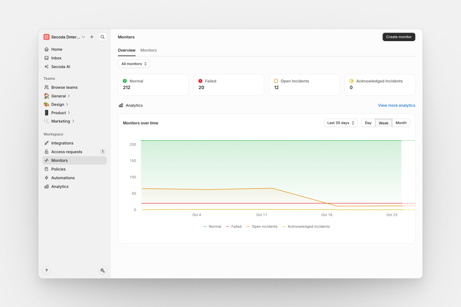
### Monitors overview
The monitors overview page provides a comprehensive view of your data monitoring health and incident management.
* **Normal**: Number of monitors currently passing their checks
* **Failed**: Number of monitors that have failed their latest checks
* **Open incidents**: Count of active incidents requiring attention
* **Acknowledged incidents**: Count of incidents that have been acknowledged but not yet resolved
***
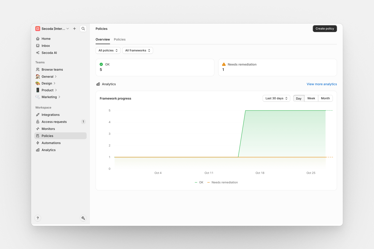
### Policies overview
The policies overview page helps you track data governance compliance and policy enforcement across your organization.
* **OK**: Number of policies currently in compliance
* **Needs Remediation**: Number of policies requiring attention or action
***
### Automations overview
The automations overview page provides insights into your automated data management processes and their effectiveness.
* **Automation runs**: Total number of automation executions
* **Tasks automated**: Count of individual tasks completed through automation
***
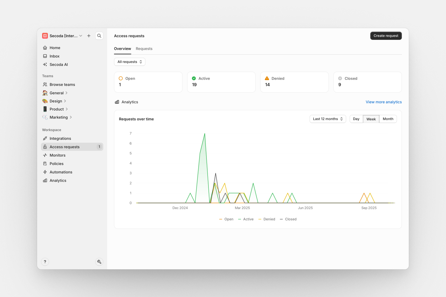
### Access requests overview
The access requests overview page helps you manage and monitor data access workflows across your organization.
* **Open**: Number of pending access requests awaiting review
* **Active**: Count of currently granted and active access permissions
* **Denied**: Number of requests that have been rejected
* **Closed**: Total of expired and cancelled requests
***
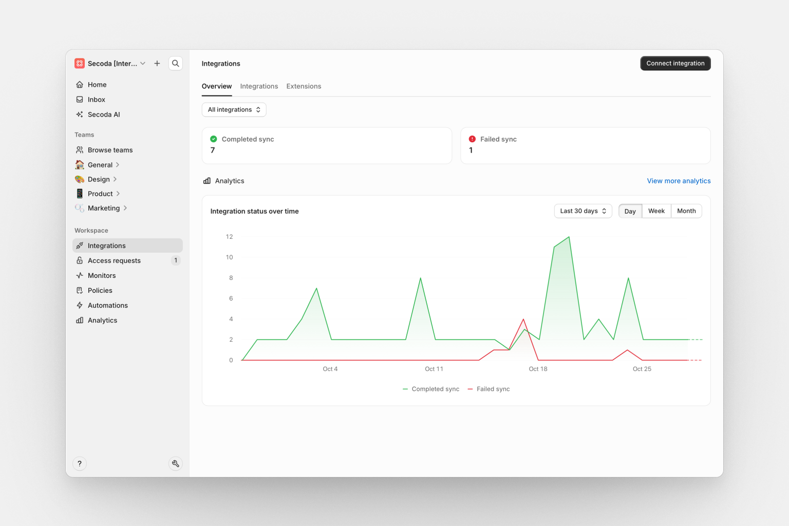
### Integrations overview
The integrations overview page provides visibility into your data source connections and synchronization health.
* **Completed sync**: Number of integrations with successful recent synchronizations
* **Failed sync**: Count of integrations experiencing sync failures
***
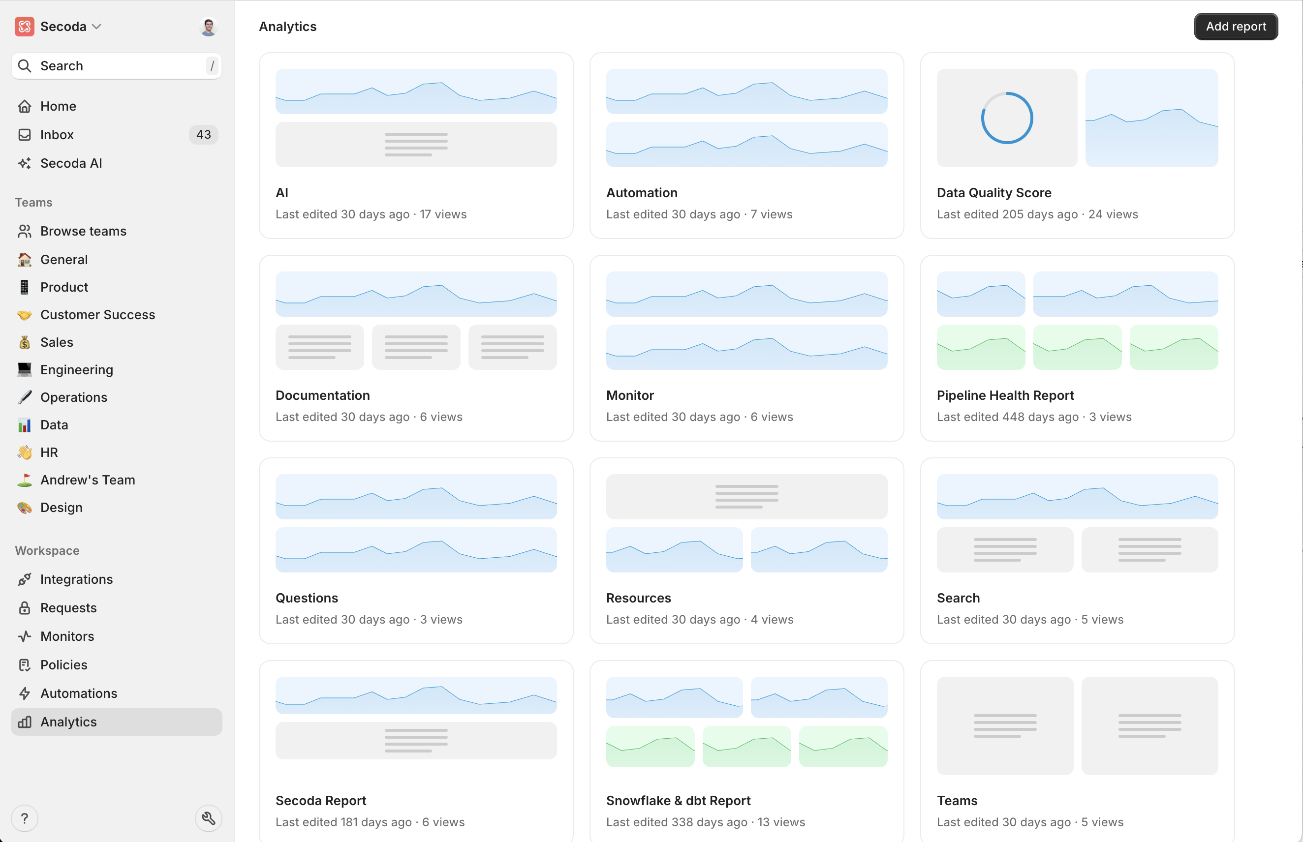
## Reports
Create reports to organize your analytics widgets into separate themes. For example, you can have one Report that shows stats on your users, another on documentation, and another on Snowflake costs.
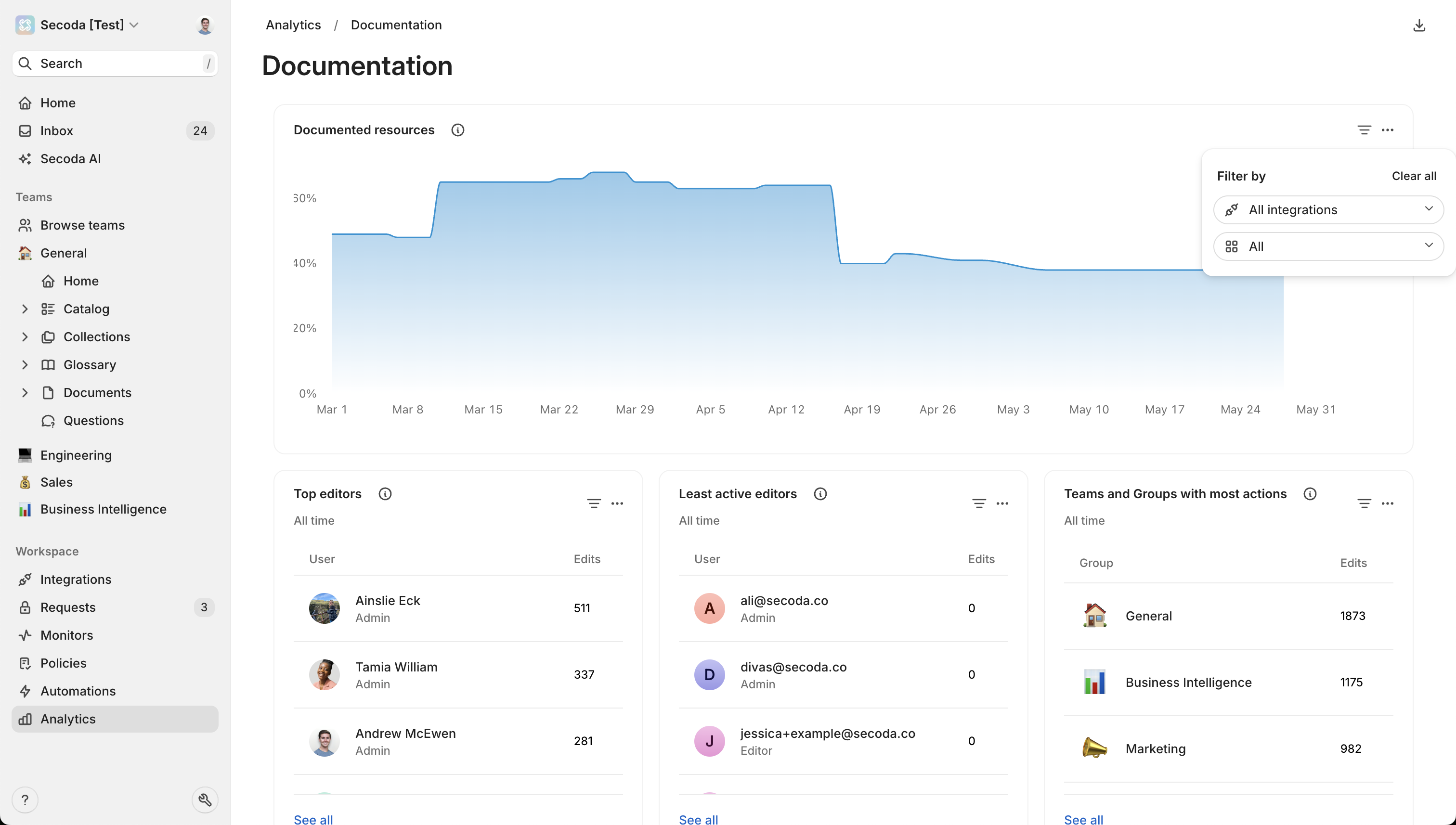
### Filtering
You are able to filter on the widgets in the dashboard. In the gif below, you can see how to filter on "Documented resources".
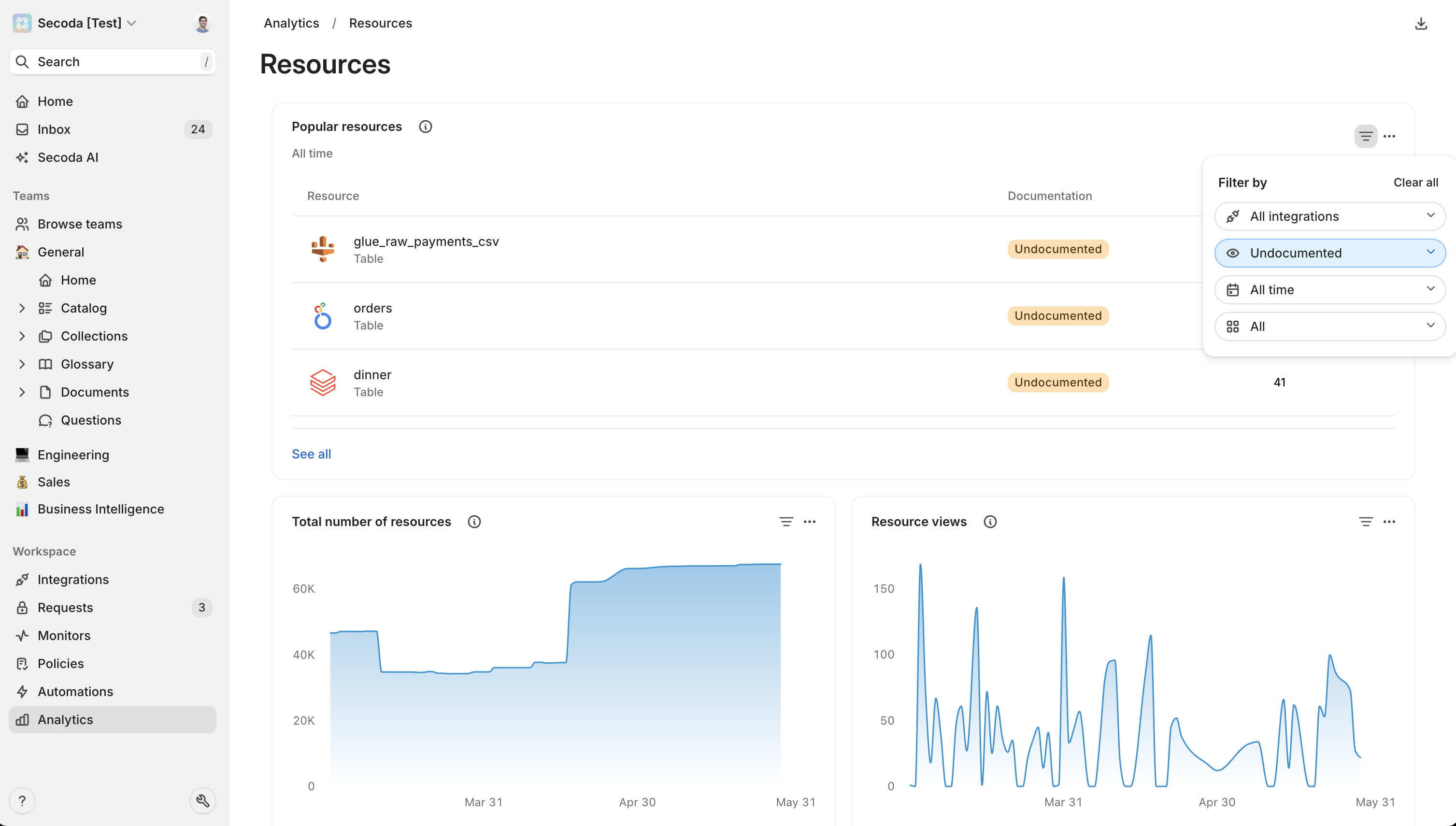
### Identifying undocumented resources
Another important metric you can filter for here is **undocumented popular resources**. This would be an important metric to know about so that you can make sure to build out the documentation since your users are often visiting these resources.
### Widgets
#### Automations
* **Automation run count**: Line chart for the number of automation runs over time
* **Automation resources updated**: Line chart for number of resources updated by automations over time
#### Monitors
* **Monitor**: Real-time monitoring dashboard showing current status and alerts
* **Monitor count**: Line chart for the number of monitors in the workspace over time
* **Incident count**: Line chart for the number of incidents detected over time
#### Secoda AI
* **AI chat history**: Table for AI interactions and conversations in the workspace
* **AI chat count**: Line chart for the n of AI chat conversations over time
#### Users
* **Daily active users**: Line chart for the unique daily users
* **Weekly active users**: Line chart for the unique weekly users
* **Monthly active users**: Line chart for the unique monthly users
* **Users with most views**: Table showing users ranked by content view count
* **Users with most edits**: Table displaying users ranked by edit frequency
* **Users with most resources**: Table showing users who own the most resources
* **Users with least edits**: Table identifying users with minimal editing activity
* **Users with most searches**: Table ranking users by search activity
#### Teams
* **Teams with most edits**: Table showing team-level editing activity
* **Teams with most views**: Table displaying team-level viewing patterns
#### Searches
* **Popular searches**: Table showing most frequently used search terms
* **Number of searches**: Line chart for number of searches over time
#### Questions
* **Questions asked**: Line chart for the number of questions asked over time
* **Question answer time**: Line chart for the average response time for questions
#### Resources
* **Popular resources**: Table for the most queried resources
* **Total resources**: Line chart for the total number of resources
* **Resource views**: Line chart for the number of resource views
* **Documented resources percentage**: Line chart for the percentage of documented resources
* **Verified resources:** Line chart for the percentage of resources that are verified.
#### Tests
* **dbt test results**: Various charts showing test execution results and statistics including pass percentage, number of failures, and model coverage.
#### Costs
* **Snowflake analytics**: Multiple widgets tracking costs, credits, query volume, and usage metrics.
Each widget can be customized with:
* Different time ranges (weekly, monthly, all-time)
* Various visualization types (line charts, bar charts, tables)
* Size adjustments (small, medium, large, full)
* Custom filters based on the metric type
---
# Agent Instructions
This documentation is published with GitBook. GitBook is the documentation platform designed so that both humans and AI agents can read, navigate, and reason over technical content effectively. Learn more at gitbook.com.
## Querying This Documentation
If you need additional information that is not directly available in this page, you can query the documentation dynamically by asking a question.
Perform an HTTP GET request on the current page URL with the `ask` query parameter, and the optional `goal` query parameter:
```
GET https://docs.secoda.co/features/analytics-dashboard.md?ask=&goal=
```
`ask` is the immediate question: it should be specific, self-contained, and written in natural language.
`goal` is optional and describes the broader end goal you are ultimately trying to accomplish on behalf of the user. GitBook uses it to tailor the answer towards what is most useful for that goal.
The response will contain a direct answer to the question and relevant excerpts and sources from the documentation.
Use this mechanism when the answer is not explicitly present in the current page, you need clarification or additional context, or you want to retrieve related documentation sections.